Showing posts with label Watercolors. Show all posts

Invitations, the first stage: Design!

>> Monday, June 21

I've been playing around with the idea of making some of my designs into invitations. So far I've put forth two designs that once I receive my replacement black ink (I swear my printer binges on ink when I am not looking!) via Amazon I'm going to print out and experiment with.

Oh and please forgive my spelling of RSVP--I know it should be Répondez s'il vous plaît--I designed these well after midnight on a work night and apparently my highschool French skills failed me miserably.


This one features my Tiny Pond Series painting Japanese Maple Leaf. The idea is to print out this image and then attach it to a piece of maroon cardstock that is a 1/4inch bigger on each side. I thought of maybe even layering the center image like that--instead of printing the maroon border, print out the maple leaf separate, attach it to another square piece of marron, glue THAT onto the invitation whichis then attached to the aforementioned largest piece of maroon cardstock. Just a thought.
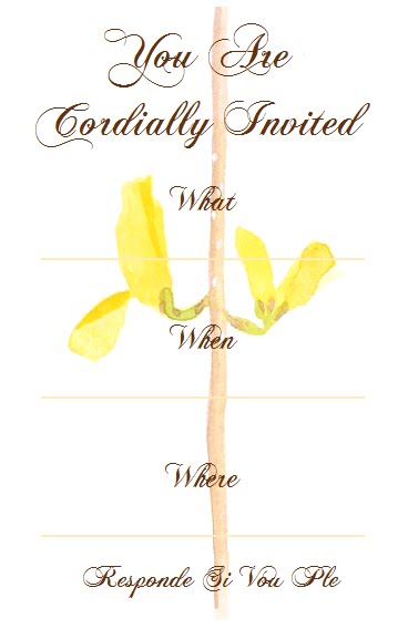

The second invitation is much simpler and more elegant. I was thinking of maybe giving this a yellow cardstock backing, but maybe not. Maybe if I just print it on lovely edged cardstock or something. We'll know when I'm done waiting on my ink. :)

Any feedback or suggestions you have would be spiffy. Thanks!!

Read more...

UPDATE: 1:12 Scale Watercolors For A Dollhouse

>> Friday, May 28


The tiny dollhouse watercolors I gave you a sneak peek of in this post are now up for sale! Click on the snapshot above to see them. :)

Read more...

C&E featured at the Invitation Buzz Blog

>> Thursday, May 27


Our bright and sunny Ugandan Sun: Kampala notecards were recently featured on the Invitation Buzz blog! Check it out.

If you like what you see, you can purchase the cards here. :)

Read more...

1:12 scale watercolors for a dollhouse

>> Tuesday, May 18


So I've been working on some new mini watercolors for a client who owns three doll houses set in 1895 England. Last night I pulled up my "reference photos" folder on my computer (a hideously large file, might I add) and browsed through it until I came to a picture that I liked, and spent the next half hour painting my own version of it. Repeat this several times and you have this little collection of paintings.

(Sorry for the lame photographs--I took them at two am by the light of my bedside lamp.)

The first letter of the little Bible verses feature gold paint and a "antique" wash that is not at all greenish like this photo implies. Just use your imagination, folks, lol.

You can see how tiny they are when you see them next to a penny! The dollhouse is in 1:12 scale, which means that anything that is a foot long in real life is only an inch long in the dollhouse. So these paintings would be 18"x18", 9"x9" and 9"x18" in real life.


I did a little research on the 1890s and it looks like it's a wonderful mix of impressionism, Art Nouveau, B&W photography and sweeping majestic landscapes. Of course, most of my research was in the American market so I forgot that images like the barn would not be very English. Duh. So that one is not going into the English dollhouse.


But the trees and the cliff might. We'll see.


I was going to frame the paintings as you can see by my first attempt below, but then the customer said she prefers to frame her own. What relief!! Lol. I am not an expert in mini framing, that's for sure.


More "dollhouse" paintings to come. Stay tuned! :)

Read more...

WIP: Another Tiny Pond painting

>> Friday, April 9

Work In Progress: watercolor, 1.5"x1.5"

The ridiculously nice weather (88F in April?!) has brought the whole county out of hibernation and into the pond store. The weeping cherry trees, daffodils, crocuses and water plants are all blossoming and growing, the fish are coming out of their underground tunnels and splashing at the surface of the ponds, and the fountains and waterfalls are flowing.


So with all this inspiration dumped in my lap I decided to take up my Tiny Pond series again. Last night I cut twenty-four new 1.5"x1.5" pieces of watercolor paper to aid this creative explosion. There are 95 reference photos on my computer for this project , so watch out world! :)


This painting is definitely not finished yet. The values are all wrong--I need to lighten areas and very much darken others--and the textures are not where I want them, e.g. the lily pads don't looks wet. I'll post more pictures when I've made some significant progress.


Reference photo I took in one of the greenhouses last year:

Read more...

Next Painting--Mr. Kitty!

>> Monday, February 22


Tell me this is not one of the most ridiculously handsome cats you've ever seen?

Mr. Kitty was a stray found out by the highway that lays in front of Garden State Koi & Aquatic Center where I work. After bribing him with food he now calls our store his home, and can be found sleeping on any of the displays or buttering up the customers. I took this picture of him sitting on my (messy! ack!) desk one afternoon, and fell in love with the angle and his I-know-I'm-the-stuff expression. So this is definitely gonna be my next watercolor.


Probably gonna do a tiny painting of just his eye, to practice capturing the beautiful colors therein first.

And then this pose is adorable, perhaps my next painting after that:


I did have a complicated painting of a woman on a stag planned--that's on hold at present.

Read more...

Interview: Crazy Cakes and Dragon Doodles with Louise Wilson

>> Saturday, November 7

I love dragons.

They're just the essence of cool. Take your favorite color, mix it with fantasy, power and fire, and you get a dragon. Oh, did I mention they're usually filthy rich? Hmm, actually someone with that description--handsome, powerful, awesome, rich-- would do pretty well on eHarmony. Until he mentions the fact that he is actually a dragon. But I digress.

Louise "Lou" Wilson's beautiful work has been a favorite of mine on Deviant Art (where she is known as ~louise-art) for a while now. With her graceful watercolors and outrageously gorgeous cakes, it really isn't fair for one person to excel in two such diverse mediums.

My favorite of her watercolors is "Firecracker."

 
"Firecracker"

The painting "actually started off as a bit of play with water and color," Lou said, "and the image began to emerge out of the splodges on the paper ...

 
"Lilies"

CLICK HERE for the rest of the post

Read more...

Interview with Reneé Lawter: Watercolorist and Plushie Creator

>> Friday, October 30

UPDATE 5/27/10: Renee mentioned the interview on her site! :)

Since coming to work for a pond design and installation company, I’ve become slightly obsessed with koi. Their bright colors, fluid movements and friendliness capture my heart. I was heartbroken when we sold “Goldie” from the back greenhouse, a 24” pale orange koi that came to the surface to greet me whenever I poked my head over his pond. Even if I failed to produce food he’d silently gape his hello, blinking as I rubbed his forehead or tickled his fins.

"Koi" by Reneé Lawter

Koi are universally beloved for their beauty, longevity and tameness. Even the word “koi” itself is a synonym for “love” in Japanese. I first came across Reneé Lawter’s beautiful watercolor, “Koi,” while browsing Flickr.

"Koi are favorites of mine,” Reneé said, “and painting the koi piece was an experience. It was like painting silk ribbons.”

Reneé Lawter's delightfully sweet logo, which she baked herself. :)

For inspiration she looked to her two Japanese fighting fish, Fishy Von Fishenburg and Madam Peach, and also her memories of a large koi pond where she used to work.

“From what I understand,” Reneé said, “koi fish mate like crazy and live very, very long lives—250 years for some—so by the end of the summer they would be like water pigs just stuffed under the water. I remember we would drop bread crumbs in (or half a sandwich, whoops!) and it would be gobbled up in seconds. I always wondered what would happen if I fell in. Eeek!"

"Karma Kreatures"

Reneé also painted a koi skateboard for the V Foundation (a cancer research charity) and ESPN XGames.

CLICK HERE for the rest of the post

Read more...

More "Ugandan Suns" and the debut of my tiny "Pond" series

>> Thursday, October 15


My beloved studio :)

Last weekend was super productive. I spent almost all my waking moments with my favorite brush in hand, humming along with Sarah McLachlan and occassionally looking up to see Caleb joining Manning in a victory celebration (Giants beat the Raiders bad, 44-7, it was sweet).


Here are the first two watercolor paintings in my tiny "pond" series featuring a water lettuce and a pink water lily. I paint from photographs I took at the pond and waterfall design and installation company where I work. I think I'm gonna do one featuring koi next, though they're hard to photograph ... hmmm.


I began with the background and underlying color.

Read more...

Sa Yekchung on Flickr

>> Thursday, October 1


"Koi 1999"

Sa Yekchung is an amazing watercolorist I came across on Flickr. He blends realism and modernism so beautifully. See for yourself!


"Bamboo Forest 0155 Watercolor"

Read more...

The First Three Paintings in the Ugandan Sun Series


"Ugandan Sun" watercolor series


(Sorry for the lousy picture quality. Taking pictures with my camera in the wee ours of the morning when I need to leave for work in two minutes does not the best photos make. (That scanner is going to be so nice.) But....)

Here they are!

The humble beginnings to my Ugandan Suns Series. These are 5.5"x8"ish, and I am hoping to add a large painting (13"x19") and some smaller paintings (perhaps 3"x3"?) to the series soon!


Circle of Life

Read more...

"Ugandan Suns" series

>> Thursday, September 10

A can of peaches sat on my blank sketchbook, smirking at my lack of creativity. What to paint next?!

So I started by tracing a circle around the bottom of the can. Then I added some triangles. And a few abstract lines. I selected a deep black and a blood red from my watercolor palette, and mixed an ochre and bright yellow to my liking. Then I filled in the shapes with a special mosaic pattern that I developed while sketching one day during a particularly lengthy sermon. And behold, my watercolor series "Ugandan Suns" was born.

Why Ugandan? Two reasons. One, the design is distinctly African, both in color and shape. Two, I am donating 50% of the profits on this series to missionary work in Uganda. More on that later.

I am now on the third painting of this beautiful series, which will hopefully become prints and greeting cards once I get my printer and scanner up and running. If I can bear it, I might even part with the originals. We'll see. I usually can't.

P.S. Caleb is currently taking donations of canned peaches (his favorite) since I need the can to be full so it's heavy and will sit still on my paper while I trace. :)

Read more...

  © Blogger template Simple n' Sweet by Ourblogtemplates.com 2009

Back to TOP